Client
GE Pharmacy
Agency
Tonic The Agency
Scope of Work
Branding / Website
Location
Sydney
GE Pharmacy is a family-owned independent pharmacy with a dedicated focus on supporting aged care facilities across the state. Alongside serving its local Melbourne community, it provides personalised pharmaceutical care to residents, families and aged care partners, including free medication packing and delivery, tailored pharmacotherapy programs, and 24/7 pharmacist access, 365 days a year.
GE Pharmacy had a highly competitive aged care model, but a brand that didn't reflect it. Its visual identity and digital presence lagged well behind the service itself.
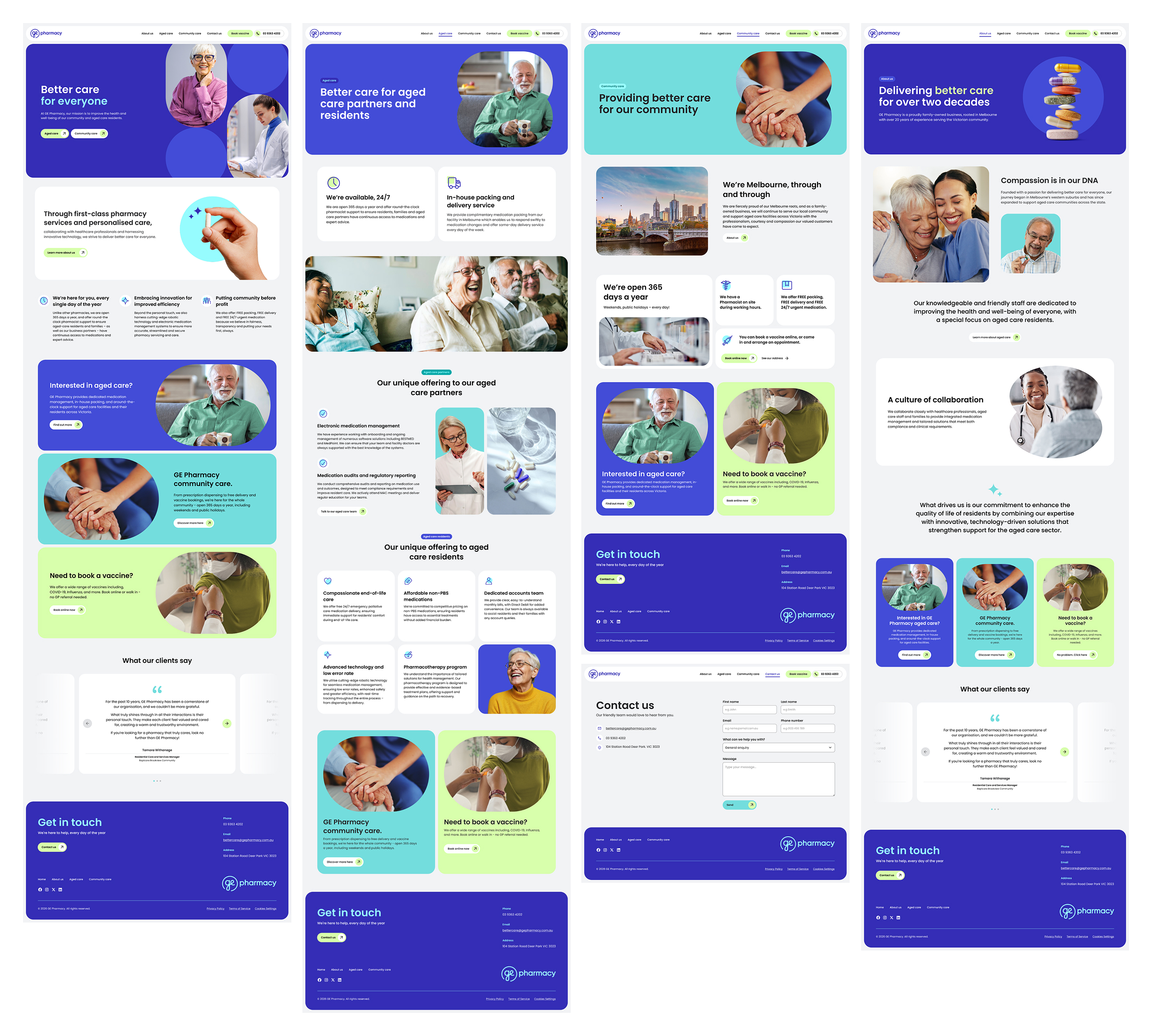
The core challenge was to build a professional, clean and trustworthy brand experience that communicated GE Pharmacy's differentiated services and established credibility with both aged care decision-makers and community customers.
To guide the brand development, we explored a wide range of references across the healthcare and aged-care landscape. The goal was to identify visual languages, design elements, and colour systems that not only connect to the pharmacy sector but also resonate with GE Pharmacy positioning.
From analysing the brands, we identified three clear creative territories Caring & Community / Modern & Efficient / Clinical & Hospital Trust. And after discussions with the client, they selected bits from the caring and modern territories, and we could agree on a final moodboard.
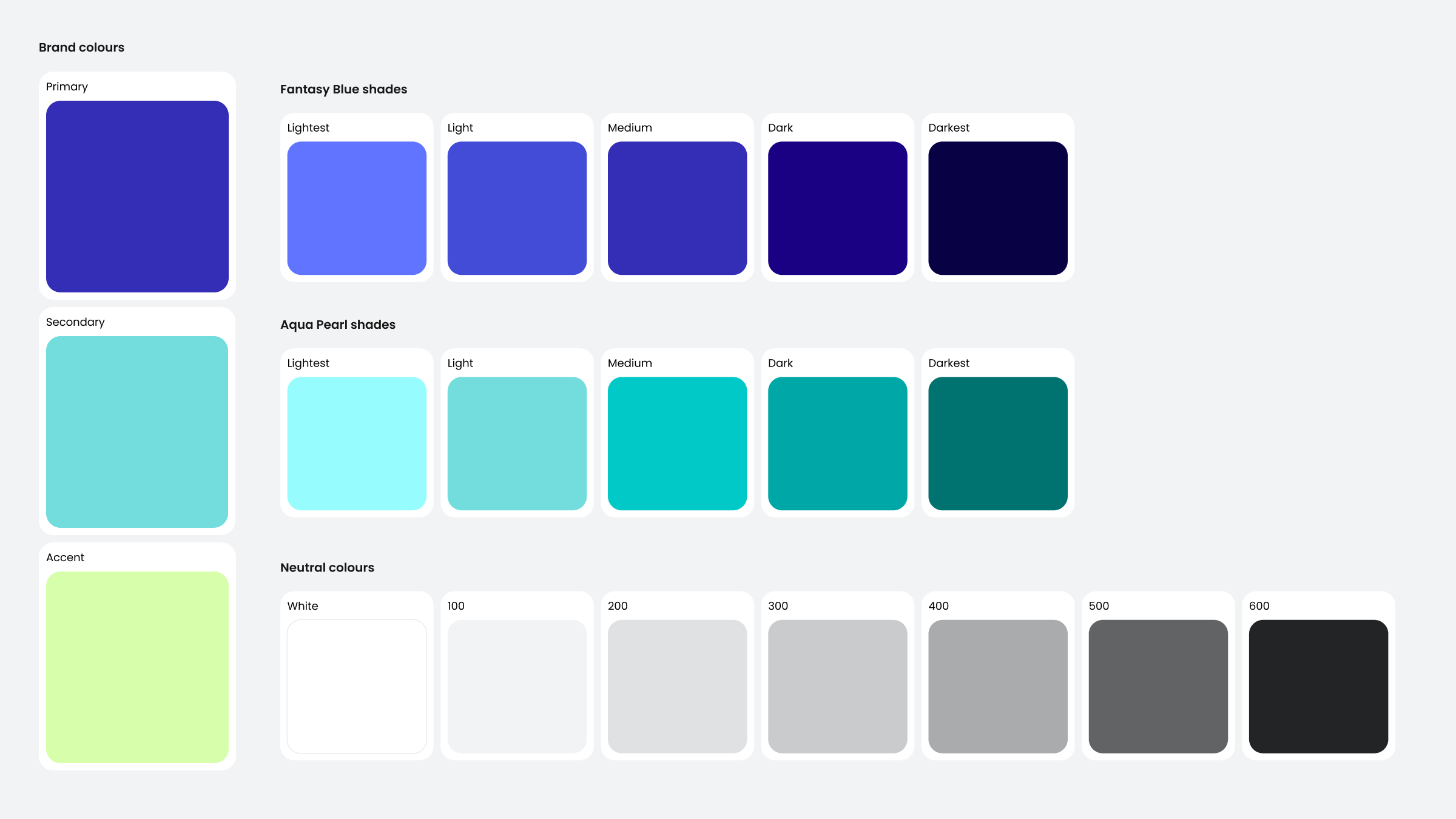
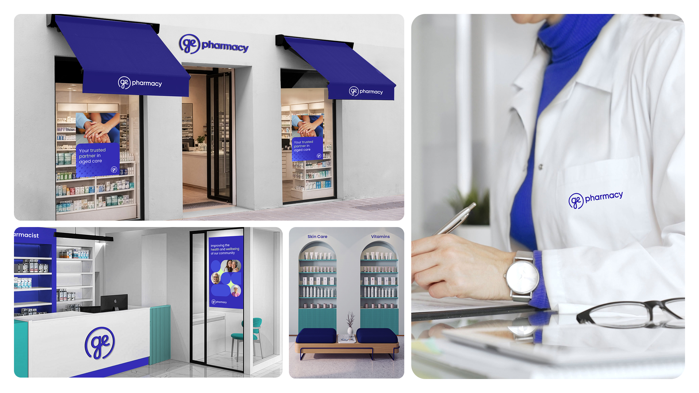
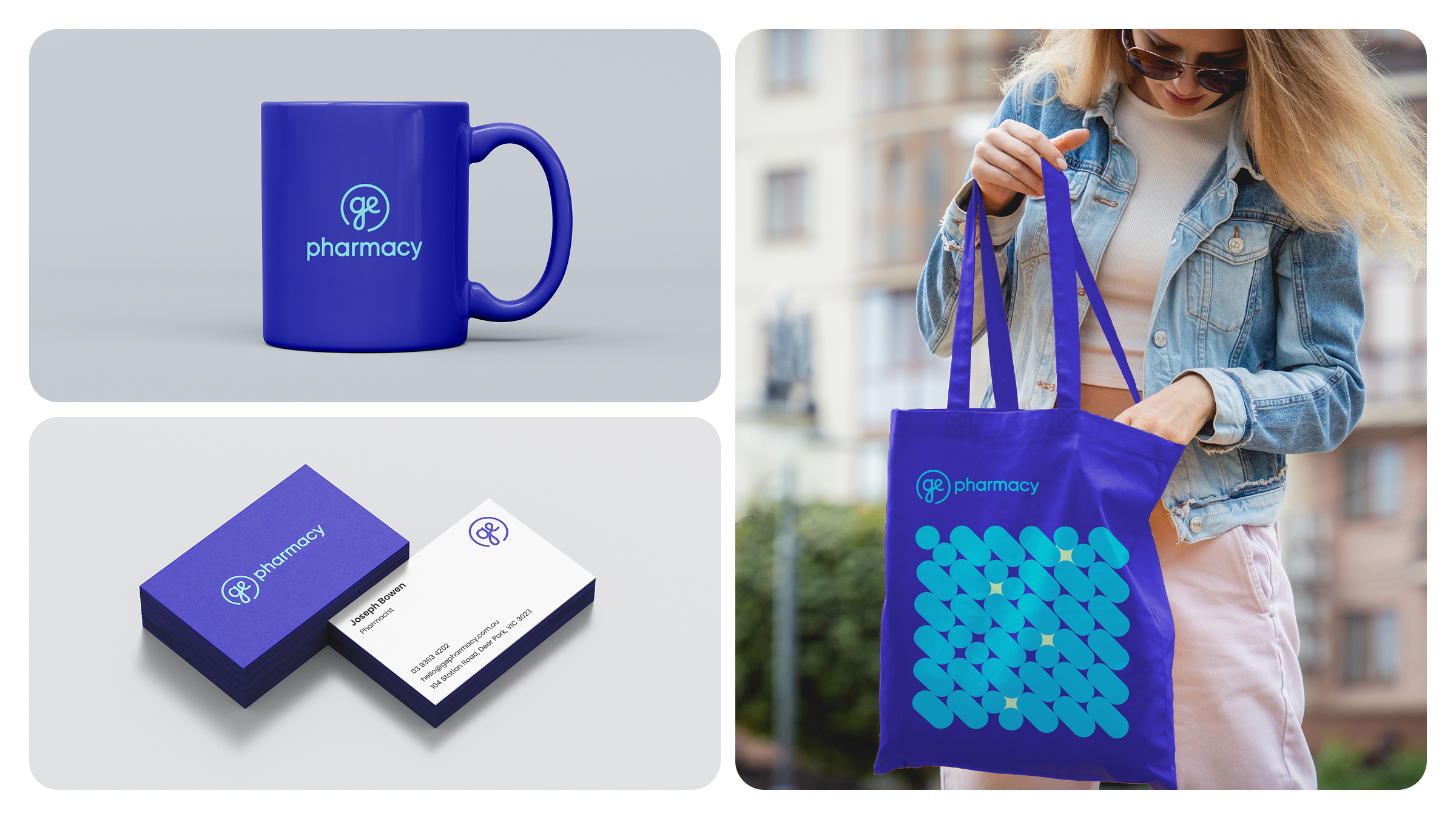
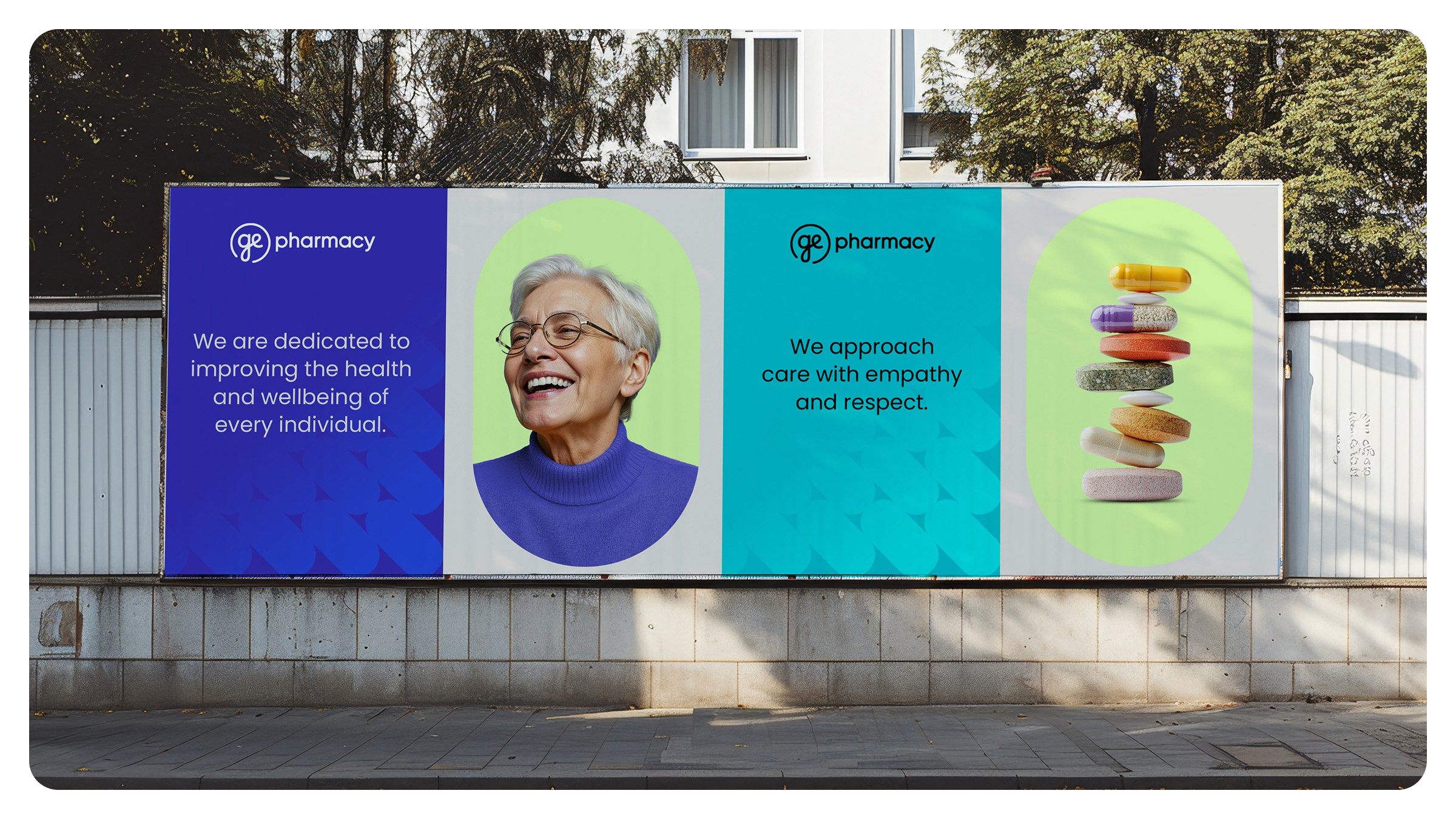
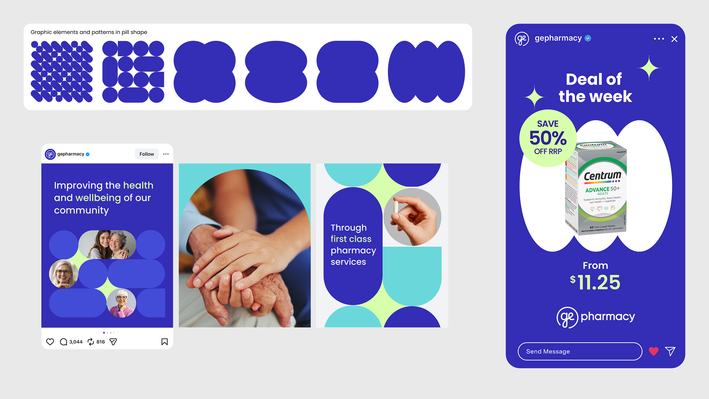
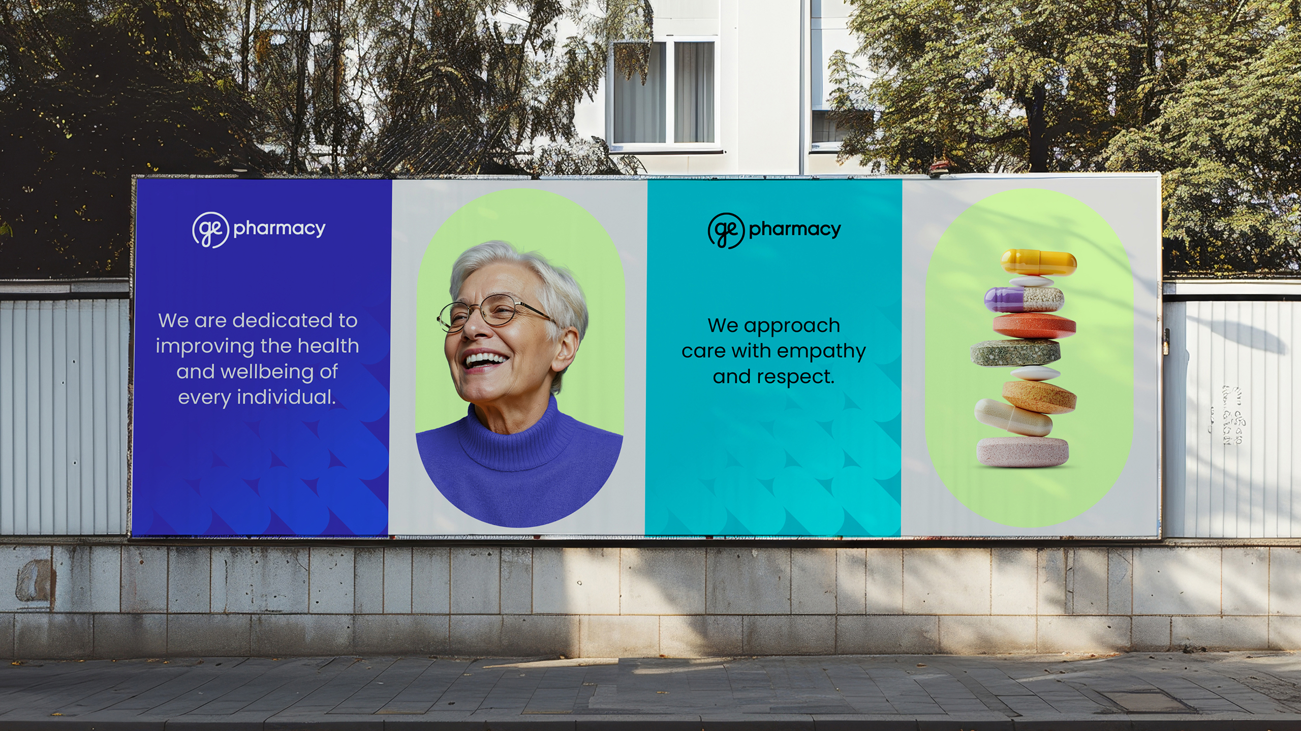
Then I designed the new brand aligned to a modern but caring style. The brand highlights empathy and human connection while bringing an efficient and clear look. These were achieved by using a fresh colour palette and modern typography that have an approachable feel. The imagery shows care/support moments, but also clean and geometric shapes, giving the forward-looking, speed and convenience energy that GE Pharmacy can provide.
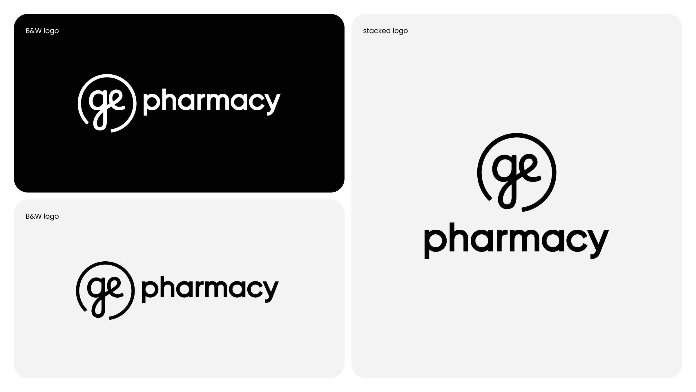
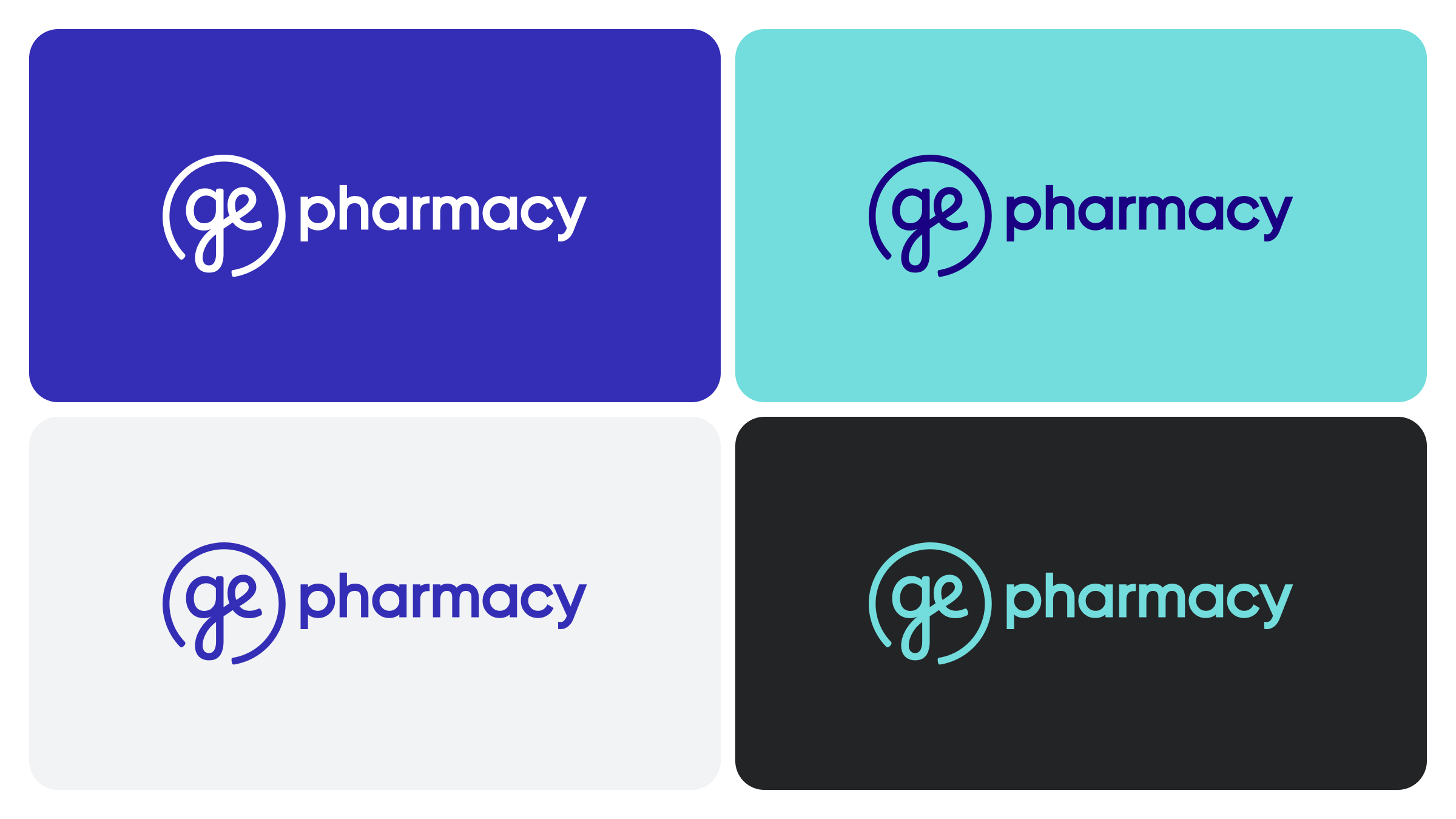
I explored the “GE” letterforms to create a distinctive, standalone logo. It was shaped to reflect the qualities GE Pharmacy wants to be recognised for - clean, modern, and trustworthy - while keeping the design approachable, human, and unique.
The rounded forms and lowercase letters make the logo feel friendly, warm, and less corporate. This subtly signals empathy and community care.
The use of soft edges and approachable curves brings a human-first philosophy. This helps GE Pharmacy stand out as a service provider that cares about people, not just prescriptions.