Client
Natura
Agency
Rafdesign
Scope of Work
Rebranding and packaging
Location
Rio de Janeiro
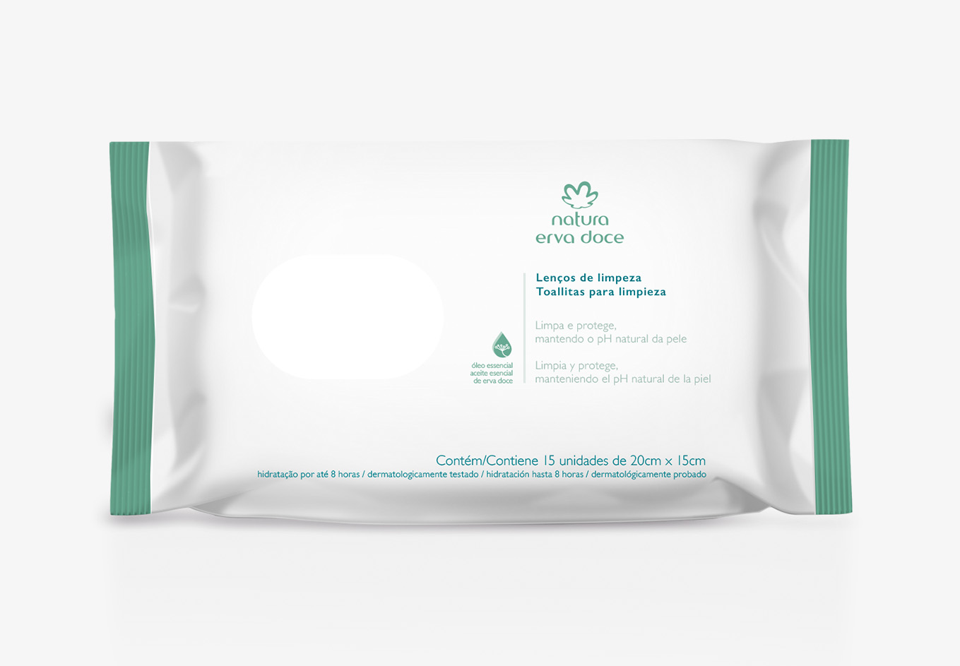
Natura stands as a prominent Brazilian cosmetics brand, offering an extensive range of products under various sub-brands including shampoos, conditioners, lotions, sunscreens, perfumes, oils, and more. Among these, Natura Erva Doce holds a special place as one of the company's most traditional sub-brands, serving as an iconic symbol for Natura.
Natura Erva Doce has faced challenges in maintaining its unique identity in the market, particularly with the emergence of competitors introducing similar products with identical fragrances. This similarity in packaging has led to consumer confusion, hindering their ability to distinguish among the available products.
Additionally, the brand has encountered the growing trend of antibacterial products in the market. While consumers have shown interest in these products promising to eliminate bacteria, concerns have arisen regarding their potential health risks. The indiscriminate use of antibacterial agents in daily products has raised alarms among scientists, as it may contribute to the development of antibiotic-resistant superbugs and disrupt the balance of healthy bacteria on the skin.
To address these issues, Natura has developed the Natura Erva Doce cleaning system, designed to respect and preserve beneficial bacteria on the skin while effectively removing harmful pathogens.
Colour: The previous yellowish-green hue of Natura Erva Doce exuded a vibrant, optimistic, and playful energy, reminiscent of spring and freshness. However, to align with the brand's new focus on technology and efficacy, we have transitioned to a bluish-green shade. According to color psychology, cooler tones evoke feelings of calmness, professionalism, and confidence, while green symbolizes balance, stability, and natural freshness, making it an ideal representation of the brand's commitment to both medicine and nature.
Logo: The previous "Erva Doce" logotype appeared unaligned and hand-drawn, lacking cohesion with the Natura brand identity. By adopting the same font for both "Erva Doce" and "Natura" and centering the logo, we aimed to establish harmony and equality between the words, emphasizing the brand's shift towards a more technologically-driven and efficient approach
Packaging: Through extensive market research, we observed common visual patterns such as stripes, white spaces, and aligned text in similar products. However, simplicity emerged as the most effective pattern, enhancing clarity for consumers. Given Natura Erva Doce's focus on skin protection, the label prioritizes essential ingredients, reflecting the brand's commitment to transparency and efficacy.