Client
Soul Spring Pilates
Agency
Tonic the Agency
Scope of Work
Branding
Location
Sydney
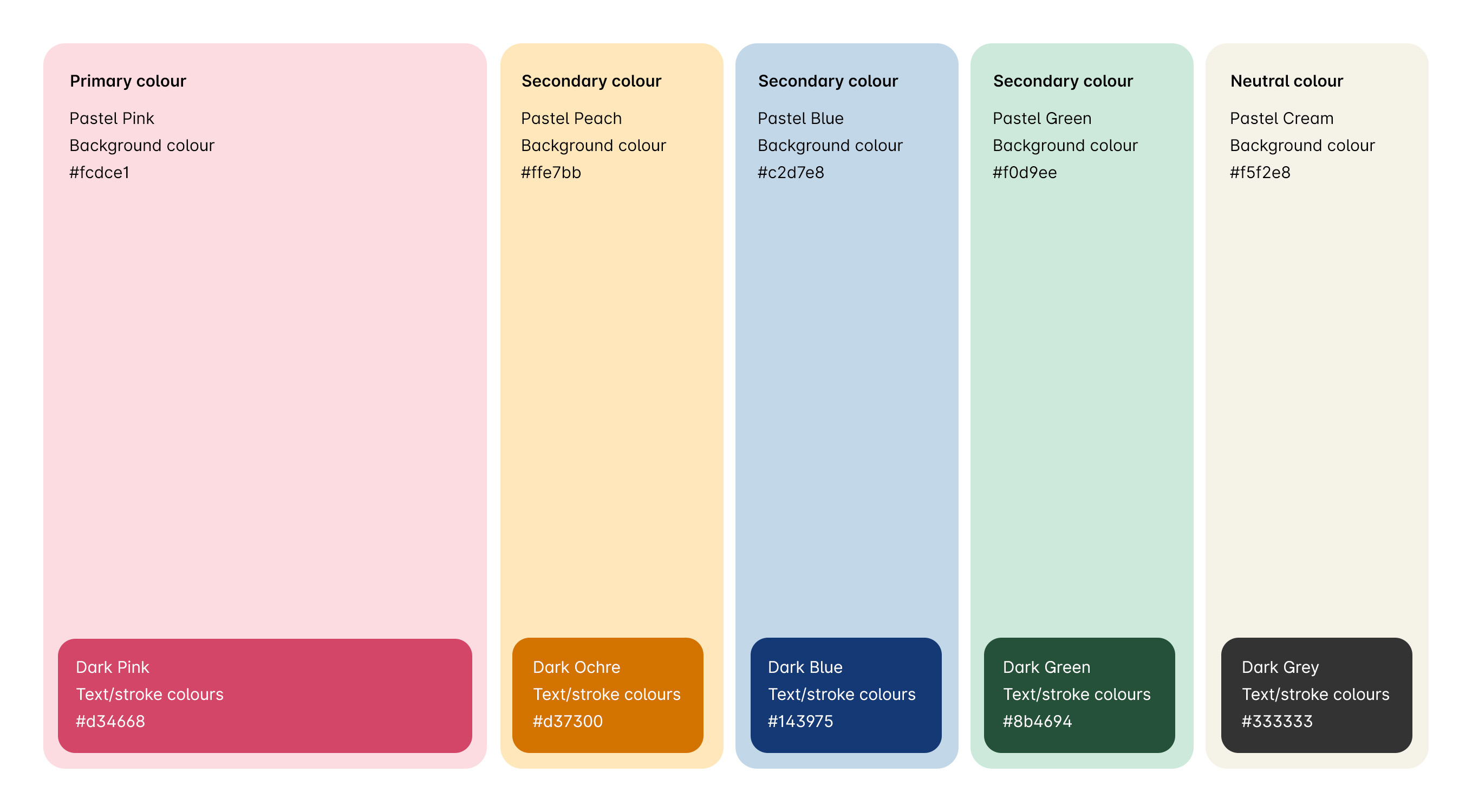
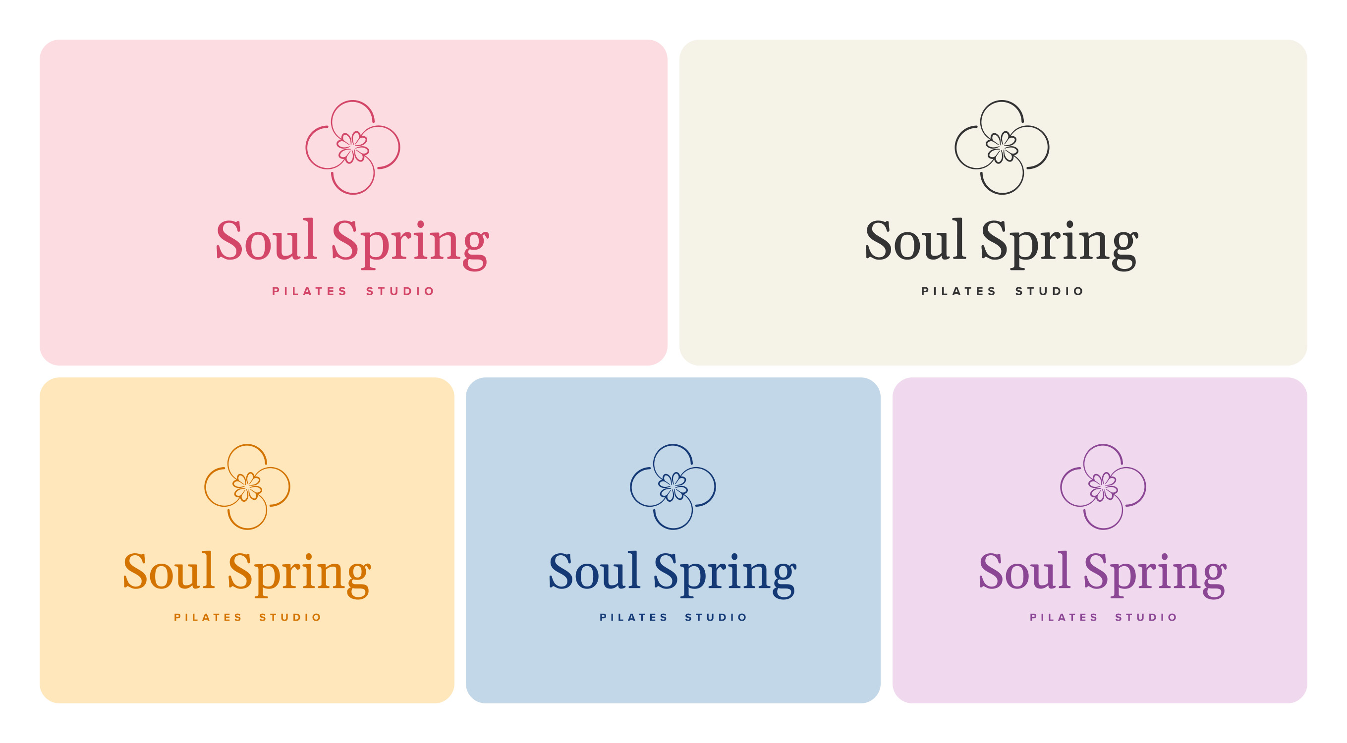
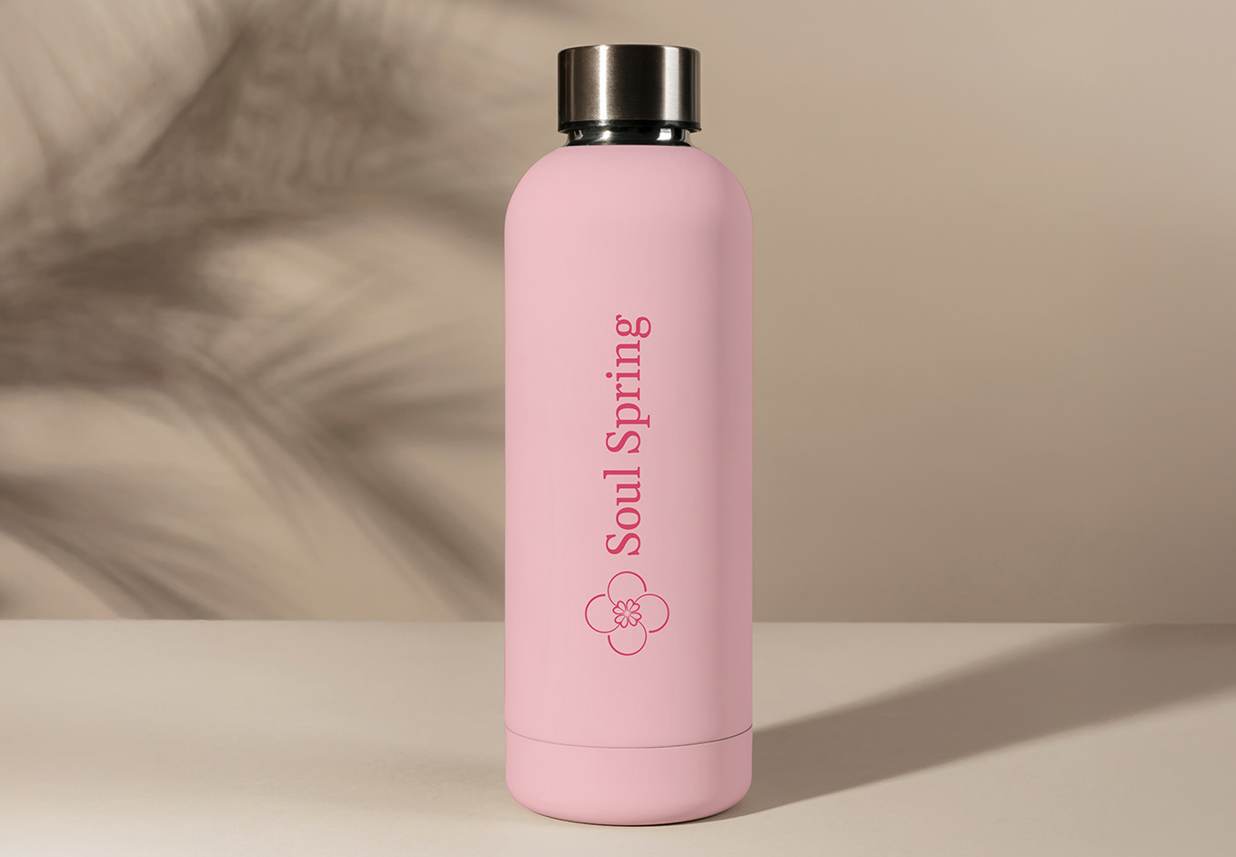
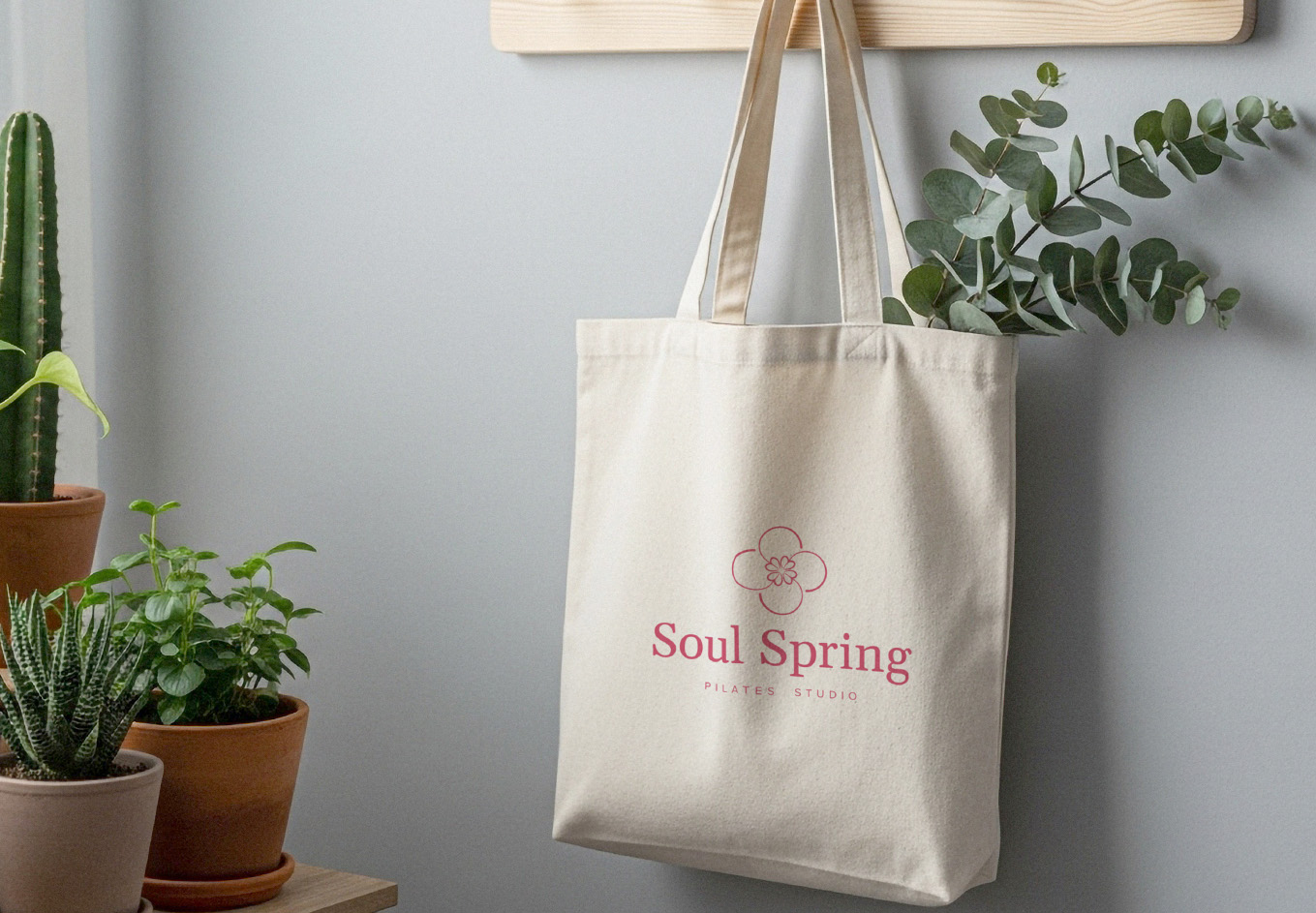
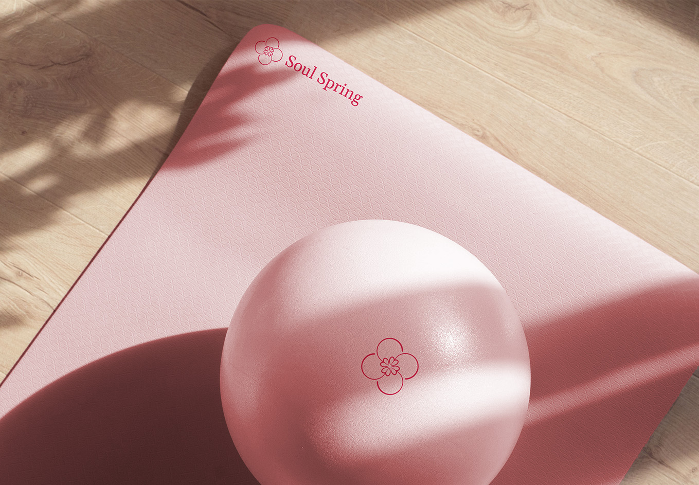
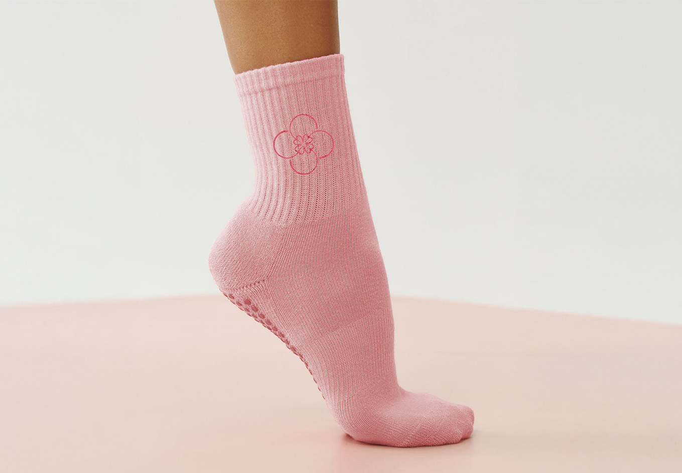
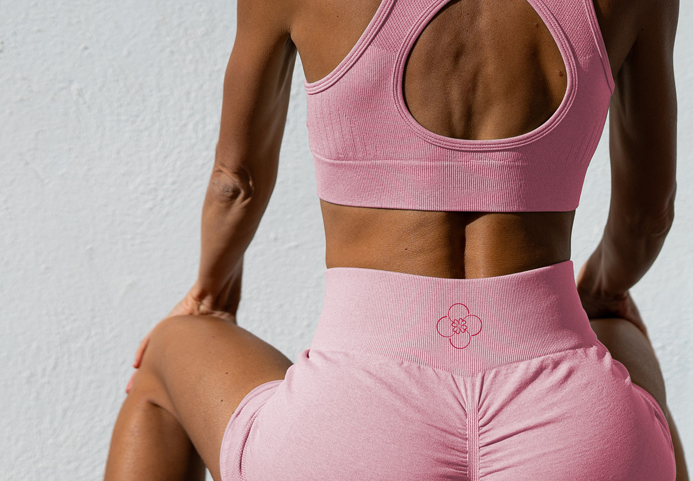
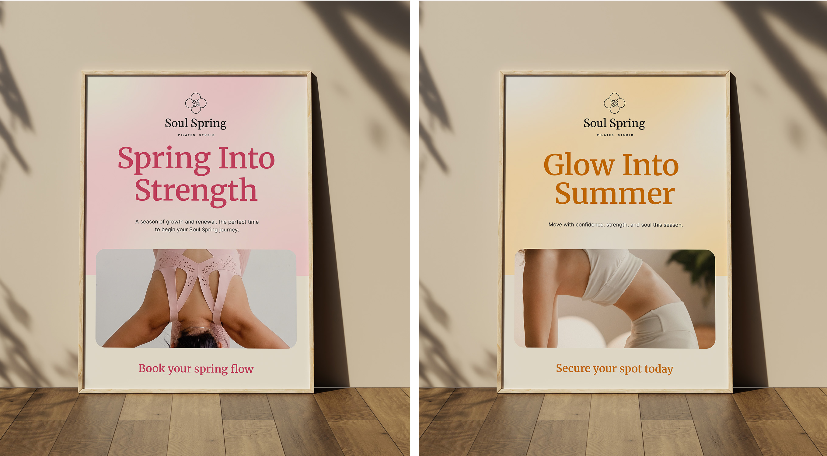
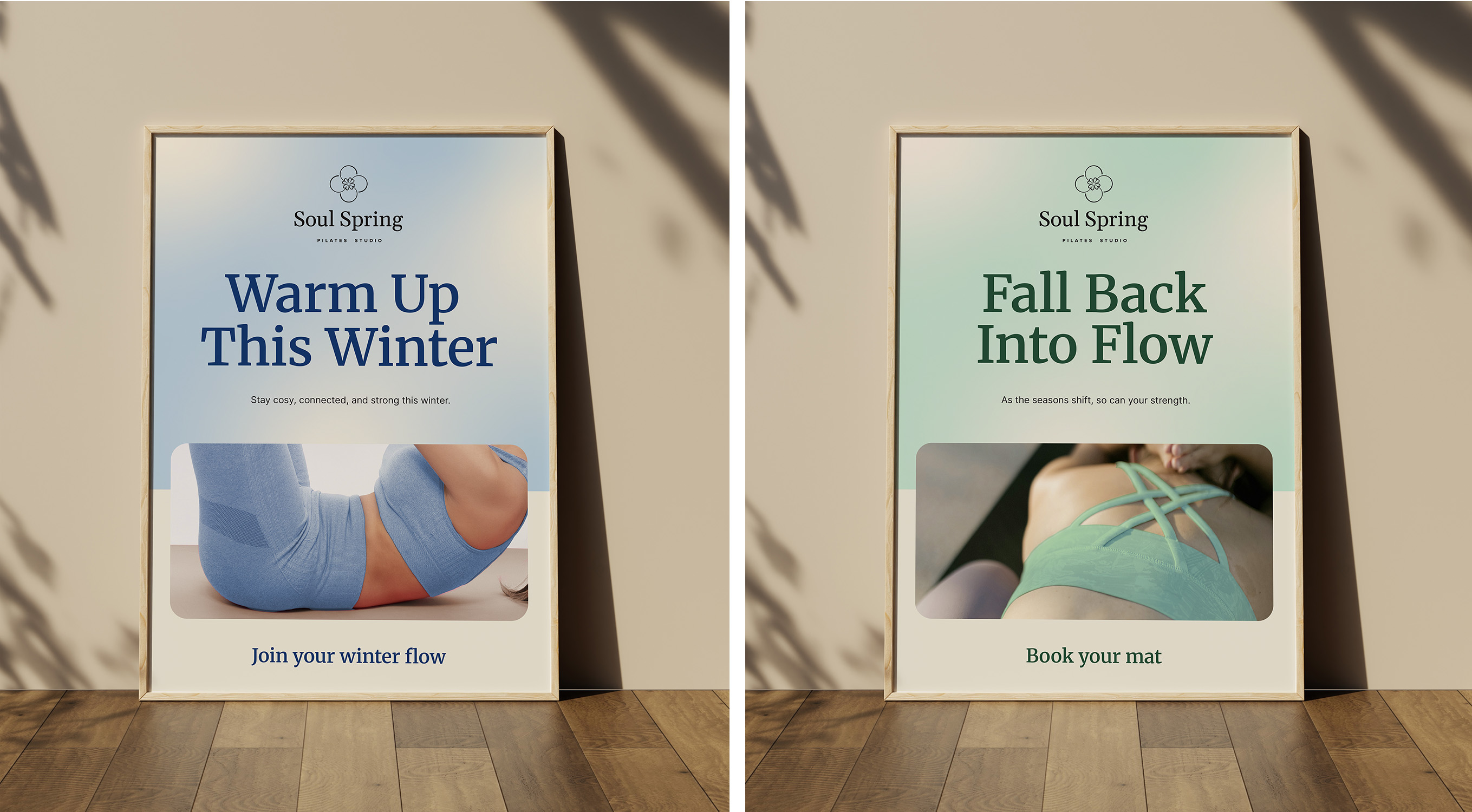
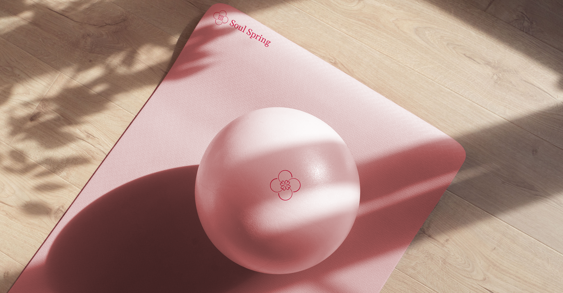
Soul Spring is a new Pilates studio based in Sydney. The founders were preparing for their launch and needed a complete brand identity. They already had a sense of the look and feel they wanted, but they didn't know how to express it. One thing was certain from the start: the colour palette. They were drawn to soft pastels, with pastel pink as the primary colour.
To kick off the project, we explored a wide range of visual expressions commonly associated with wellness brands - from photography styles to typography and pastel colour palettes. We created mood boards that grouped these references into distinct visual directions, each reflecting a different brand personality and the type of audience it might attract.
Through iterations, we arrived at a clear direction. The brand needed to communicate sophistication, timeless design, and a sense of luxury wellness. Soul Spring would be positioned as a premium studio, but without feeling cold or exclusive. The pastel palette was key to bringing in joy, motivation, and a sense of community. Overall, the visual identity should feel youthful and optimistic - like fresh morning energy.
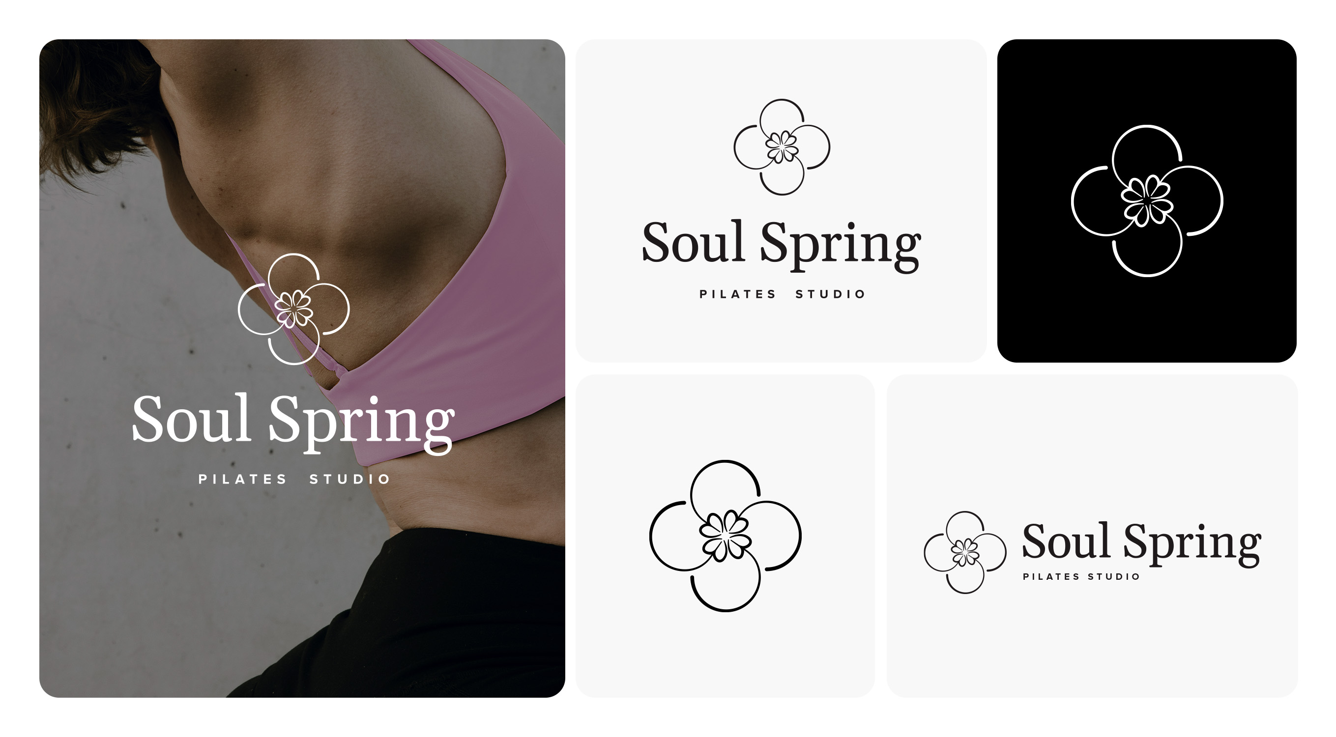
For the logo, I explored the double letter “S,” transforming it into a circular, symmetrical floral motif. The circular form connects to the idea of the soul in many symbolic and spiritual traditions, representing wholeness, unity, and connection. The symmetry and flowing lines reflect the essence of Pilates itself — strength, grace, balance, and centred movement.