Client
Havaianos Market e Delivery
Agency
Rafdesign
Scope of Work
Branding
Location
Rio de Janeiro
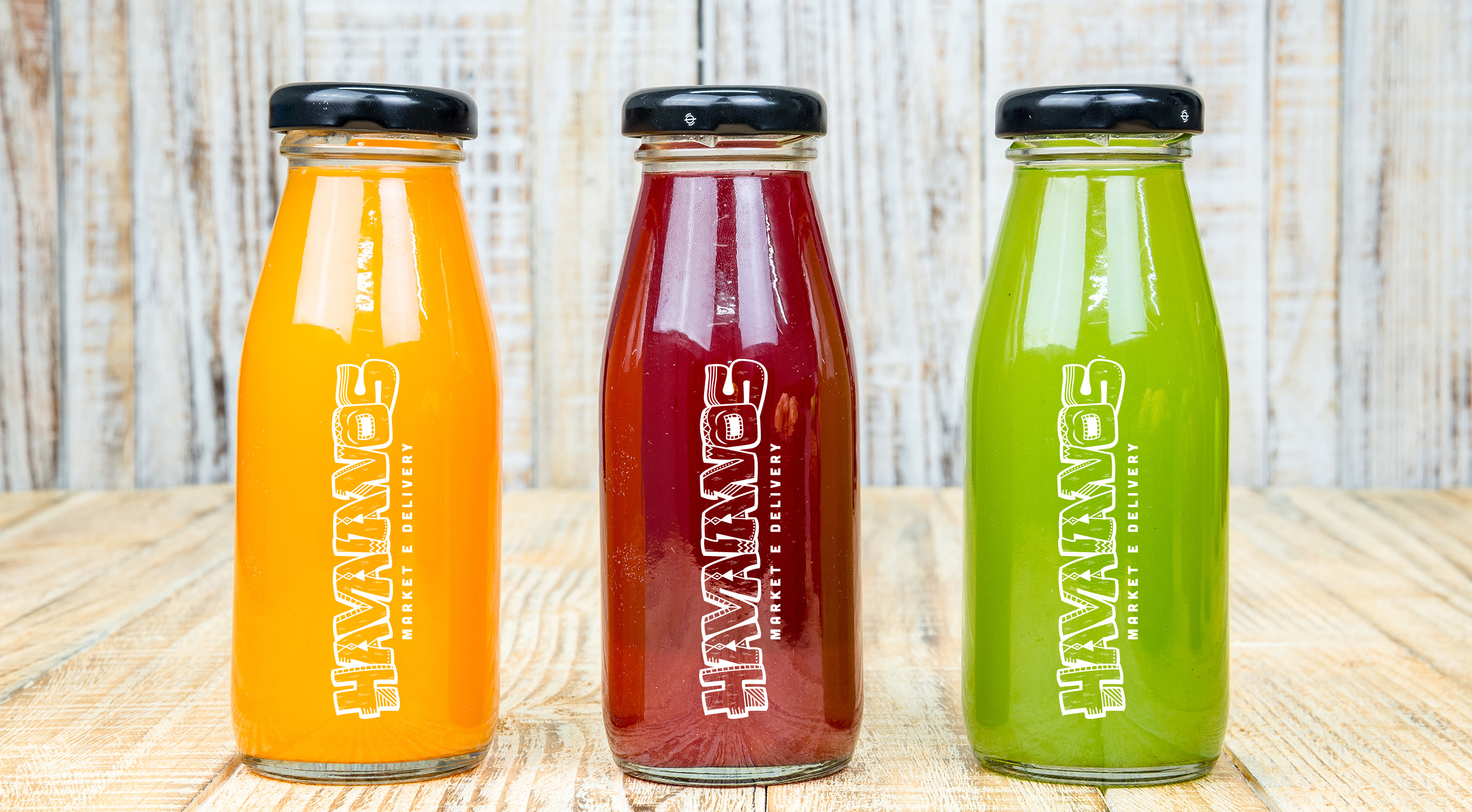
A mix of a snack bar with a small healthy food market. Havaianos’ clients are not only into healthy food, but are also seeking on-the-go light snacks, that give energy for physical activity. They have a range of different salads, açaí, tapioca, omelettes and others.
The previous brand had many design flaws such as compromised legibility, print and identity due to the many Hawaiian elements attached to the logotype. Therefore, the client asked for a brand redesign that solved the issues of the current logo. However, it still needed to have Hawaiian elements and also give off a sense of humor, proximity and lightness.
The idea was to create a fun lettering related to the Tiki god (a Hawaiian god) representation, usually carved on wooden totem poles. The new brand embodies natural and rustic elements and displays a hand carved aspect in order to enhance the company’s style - Hawaiian, natural, fresh.
Colour inspiration: Hawaii has a lush nature, with a characteristic fauna and flora. There are a huge variety and vibrant colors. It is possible to find different tones of colors in the sea, sand, flowers and leaves. This polychrome inspired me to choose three colors - pink to depict flora, aquamarine to depict the Hawaiian sea and beige to depict the sand.