Mindbreaks Branding
Project type
Master project
University
Billy Blue College of Design
Scope of Work
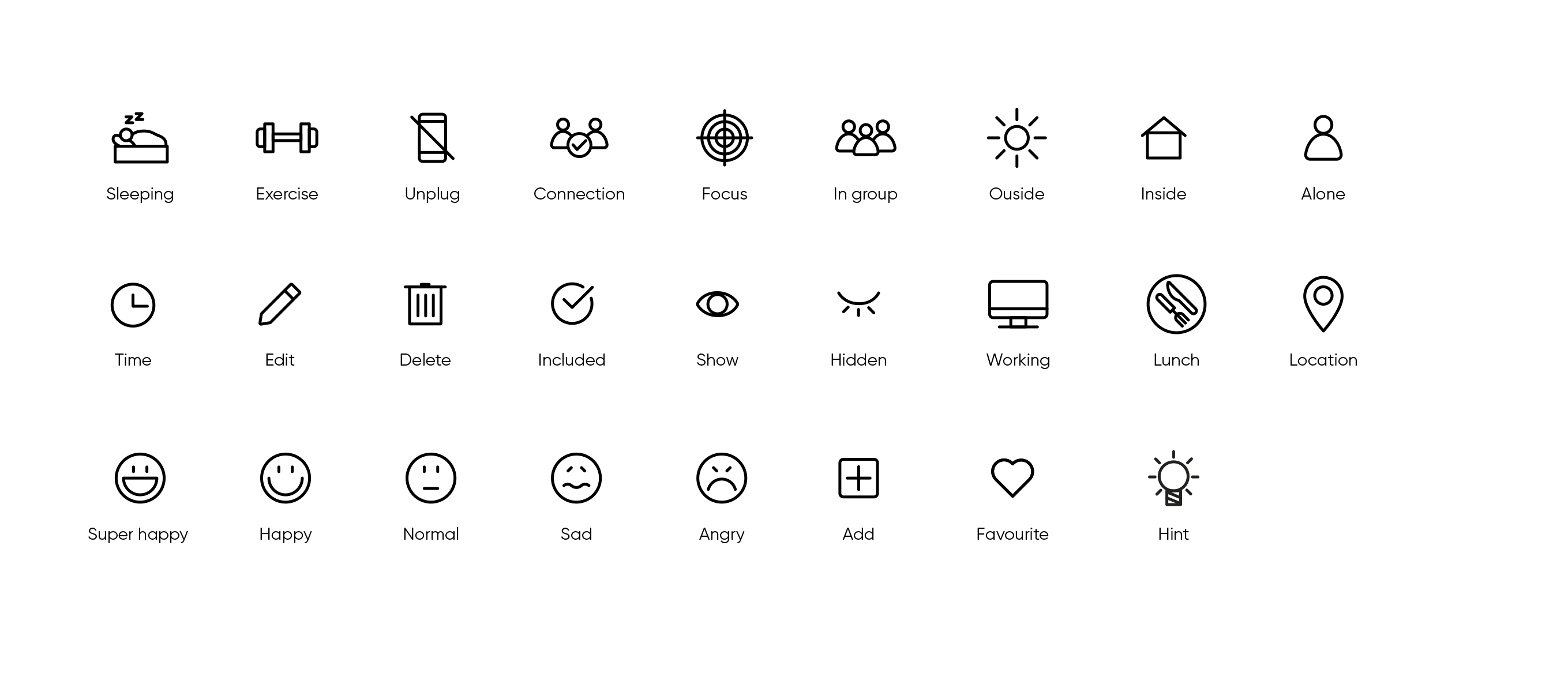
Secondary research, Idea, Qualitative Research, Wireframe, Prototype, Usability test
Location
Sydney
Summary
Since 2019, the world has been coping with COVID-19, and people were advised to stay at home to avoid the virus spreading. Consequently, working from home turned out to be the best option, and many organisations had to adapt to remote work in a short period. This massive shift became a perfect moment to analyse the effects of working from home on people. Although it has many benefits, it also brings struggles such as related to mental health. Therefore, Mindbreaks is an idea of an app that helps to balance the workers home routine.
This design system was developed to contain guidelines and resources to design MindBreaks app strongly. Those principles are essential for establishing a consistent experience and efficiency when building any media related to the Mindbreaks brand and apps.
Logo
The logo’s icon refers to the most common activity workers do during breaks - drinking coffee. The coffee break is very representative for most of the cultures as a break time. Besides, the wordmark typography was chosen to be friendly and casual.The design system shows how to properly apply the logo in colours, black and white, how the icon should be used without the wordmark, the exclusion zone around the logo and the misuses.
Colours
Colours affect people’s moods. Therefore, the colours were selected to convey wellness better and help to relax our minds. The palette tries to have “a nature-infused hues. Nature shades such as blues, greens, pastel pinks, burnt orange, and terra-cotta are calming options.