Client
Johnson & Johnson
Agency
Rafdesign
Scope of Work
Packaging Design
Location
Rio de Janeiro
Year
2018
Johnson & Johnson is an American multinational medical devices, pharmaceutical and consumer packaged goods manufacturing company founded in 1886. The corporation includes some 250 subsidiary companies with operations in 60 countries and products sold in over 175 countries. Among its well-known consumer products are the Band-Aid Brand line of bandages, Tylenol medications, Johnson's baby products, Neutrogena skin and beauty products, Clean & Clear facial wash and Acuvue contact lenses.
Johnson’s Adult goal: Harmonizing the Brand Architecture
The trusted heritage and loving sense of home that is uniquely Johnson’s provides the landscape to create a new adult’s platform of the everyday wonder women. The Brand purpose is to nurture the POWER OF GENTLE.
POWER OF GENTLE - although “power” and “gentle” are not typically seen in the same phrase, the expression “Power of Gentle” is the fusion of Johnson’s Adult past history and future potential. This unique combination of “power” and “gentle” flows Johnson’s Adult embrace the tension of “strong-soft” in everything they do.

Johnson’s Adult found out the importance of colors for their products that used to be white. Consumers find/buy/look for the product by colors. It’s the first thing they remember and look for when buying. Branding and impact at POS (point of sale) became the top priority for packaging review. Therefore it was important to change their bottle shapes and colors in order to create shelf-impact and harmonize the brand architecture throughout their global presence. Along with this change, they also needed the labels updated to reflect the brand purpose and three different needs of consumers:
Johnson’s Adult found out the importance of colors for their products that used to be white. Consumers find/buy/look for the product by colors. It’s the first thing they remember and look for when buying. Branding and impact at POS (point of sale) became the top priority for packaging review. Therefore it was important to change their bottle shapes and colors in order to create shelf-impact and harmonize the brand architecture throughout their global presence. Along with this change, they also needed the labels updated to reflect the brand purpose and three different needs of consumers:
Daily Body Essentials: "I want to meet my daily body care baseline standards.”
Confident Body Beautification: “I want to give the best impression of myself.”
Healthy Emotional Transitions: “I’m seeking a positive mood change - charge me up, wind me down or center me.”
The Brand Purpose of Johnson’s Adult became the inspiration for the new package design along with other specific objectives of the category.
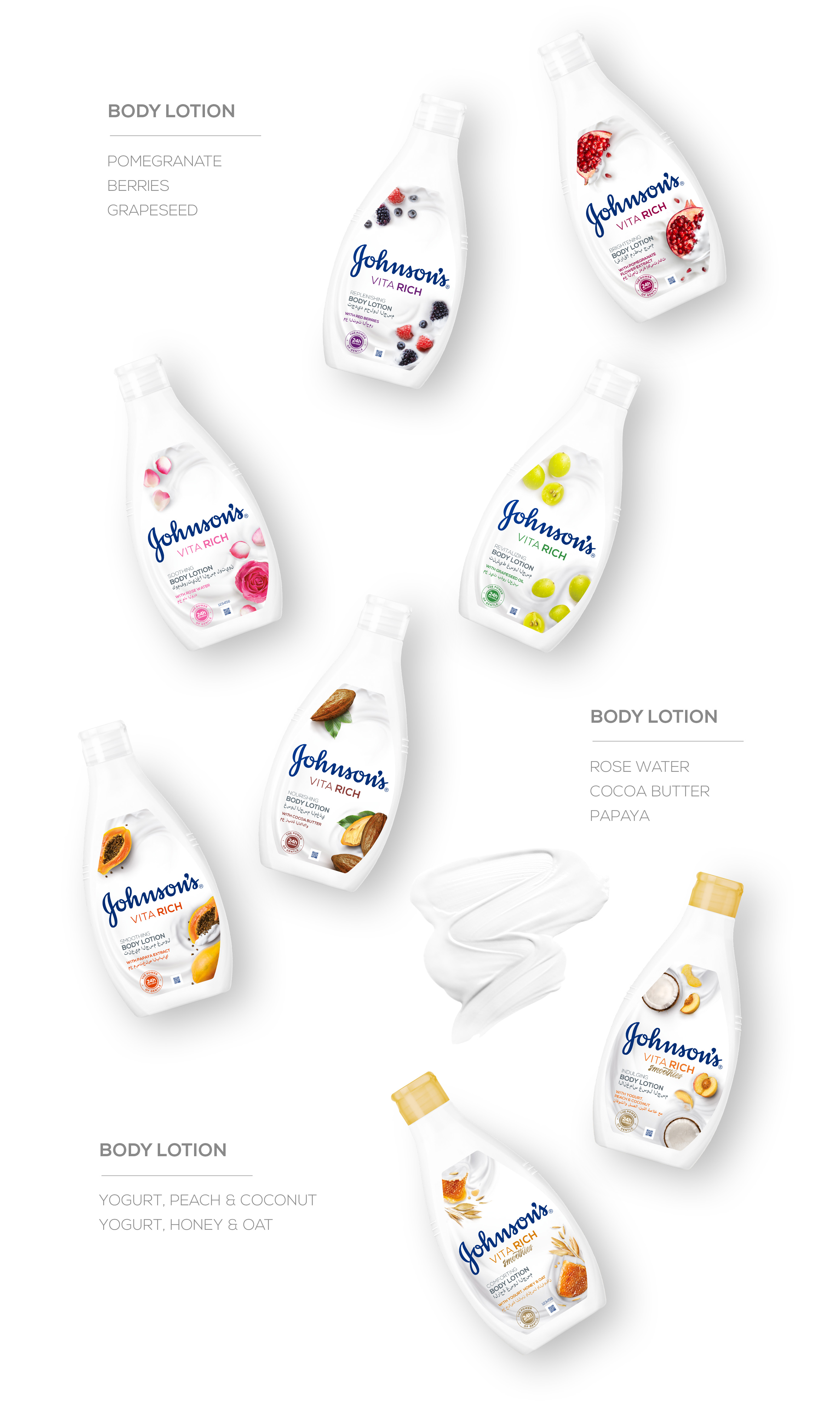
Below you’ll be able to see part of EMEA’s Johnson’s Adult architecture - VITA RICH - It restores the skin’s natural moisture leaving it with a noticeably healthy glow and wrapped in a fragrance that stimulates the senses.
Along with Johnson’s marketing and designers, we were able to develop a number of variants and product types of the Vita Rich platform. As soon as the main visual ID was approved, we started our long and meticulous work:
1. Ingredients bird view photos.
2. Manipulation and retouch of each ingredient.
3. Ingredients and other elements composition and refinements, color studies, print trials, consumer testings and design intents.